
Bathrooms Beyond the Hotel Look
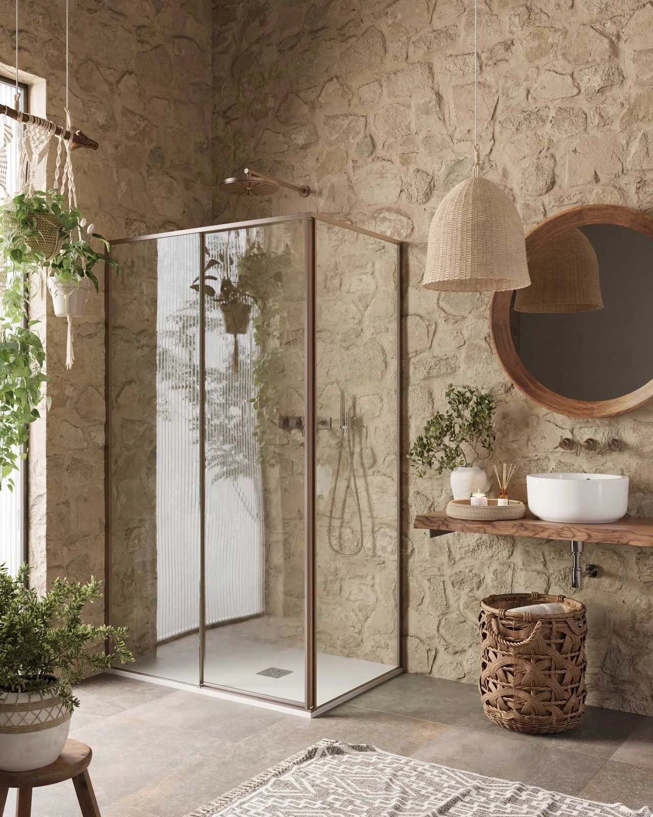
The white basin is one of the quietest things in this bathroom. Around it, the wall has deep joints and uneven faces, the timber shelf has an irregular edge, and a woven pendant casts a broad rounded silhouette. Much of the room's character is already there before we begin looking at the fittings.
Viscato's Shower Cabin Series for PDP Box Doccia offers several ways to explore that distinction. By the “hotel look,” I mean the familiar shorthand of polished surfaces, a neutral palette and neatly coordinated accessories. The more interesting question for a home is what makes those choices feel particular to the room. Here, the answers lie in the relationships between surfaces, furnishings and light.
Let the room set the tone
The wall continues behind both the shower and the basin. Its irregular pattern gives the two areas a shared background, even though the glass divides them. Small shadows around the raised stone shapes make the surface feel substantial. Against it, the enclosure's straight frame provides a clear outline, while the basin's smooth curve gives the eye somewhere quieter to settle.
The objects around the basin take their cue from that background. The mirror's timber rim relates to the shelf below. The pendant and basket introduce two different scales of weaving, held together by their warm colour. The plant leaves bring a looser shape beside the window. Each element varies the room's texture without demanding an entirely new palette.
What makes this persuasive, for me, is the connection between the large surfaces and the smaller choices. The basket could be replaced and the room would retain its identity. The wall and shelf carry enough of the idea that accessories can support it without having to explain everything.
There is restraint within this busy material arrangement. The plain basin and transparent enclosure leave the wall visible. Giving every fitting an equally elaborate shape would make that relationship harder to read. Here, the strongest texture has room around it.
A quiet room can still have preferences
A pale bathroom can express an equally deliberate point of view. In the next interior, fine speckling replaces the rough wall, the vanity forms a long clean line, and black metal marks the shower's edges. The character appears in a smaller set of connections.
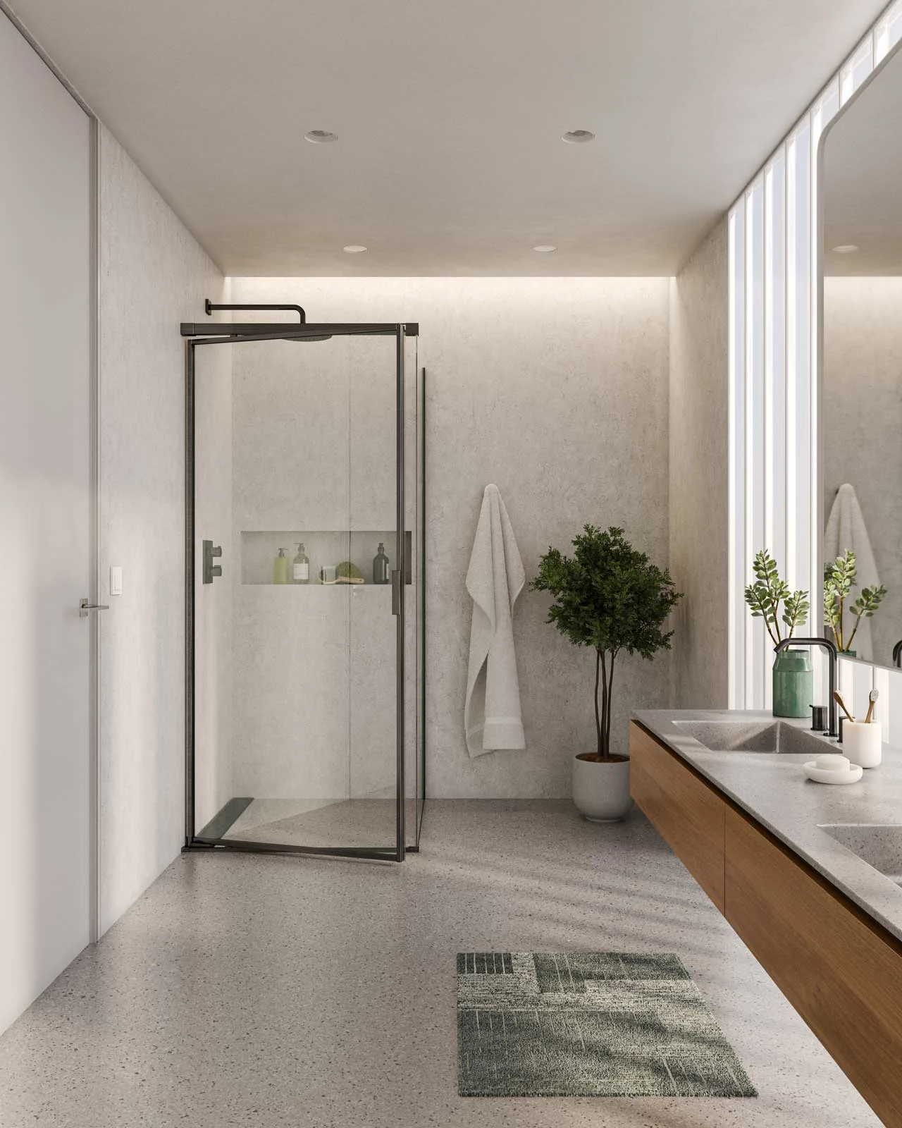
The green mat catches attention in the foreground. Farther into the room, a green jar and leafy stems on the counter pick up that colour, with a small tree beside the shower carrying it into the background. These objects differ in size, shape and purpose. Their colour gives them a relationship without making them look like a matching set.
That is enough to give the restrained palette a direction. Imagine the same pale surfaces with every accessory chosen independently: the room might still be tidy, but this thread through the image would disappear. A few related choices make the arrangement easier to understand.
The vanity matters too. Its long timber front gives the right side of the room a continuous warm surface, balancing the dark vertical shower frame. The exposed floor beneath it helps that length read clearly. The room's organisation supports the colour choices, with space around the mat and a clear view towards the plant at the back.
This suggests a useful way to think about continuity with the rest of a home. A timber tone or a particular green could recur in another room without requiring every space to share identical finishes. The connection can be modest. What matters is that a choice has a reason to belong.
Make space for softness
There is another way to give a bathroom a room-like quality: change how the larger surfaces meet the light. In this interior, the tall curtains beside the bath have as much presence as the stone-like floor or the shower glass.

The pale sheer fabric forms a bright plane at the window, while heavier folds beside it give that edge depth. A broad-leaved plant stands between the curtain and the bath. Its silhouette breaks up the long vertical lines, and its reflection carries some of that shape into the enclosure.
Across the room, a patch of light reveals the wall's finer texture. The hanging robes introduce a different kind of fold at a smaller scale, close to the basin and folded towels. Softness is distributed through the view, from the full height of the window to things within reach of a hand.
The curtains are the detail I would keep in mind when considering the rest of a house. They use a visual language familiar from bedrooms and living spaces: long fabric, filtered brightness and a softened boundary. That language could continue into a bathroom even when its fixtures and surfaces have a different role. The render shows the atmosphere of that possibility; it leaves the adjoining rooms to our imagination.
A bathroom starts to feel individual when its ordinary elements belong to a clear idea. I would ask where a favourite towel, a different soap dish or an everyday bottle could sit within that idea. A room with character should have enough confidence to accommodate them.
Visualizations by Viscato, used with permission. Shower Cabin Series is a collection of bathroom product visualizations for PDP Box Doccia, presenting shower enclosures in different interior settings.