
Reading the Character of Stone in a Render
A grey floor stretches from the front door to the edge of the frame. Its rectangular joints form a quiet grid, while darker, branching marks move within each tile. One gives the floor order; the other gives it variation. The character of the stone emerges in the space between them.
Without Camera's Stenbolaget visualizations provide my starting point for reading how stone acquires character in an image. They present several tile finishes in the same entrance hall. This consistency makes the room more than a neutral backdrop: the door, rug, stairs and furniture give us a stable sense of scale, while three viewpoints let us move from the whole interior towards the surface.
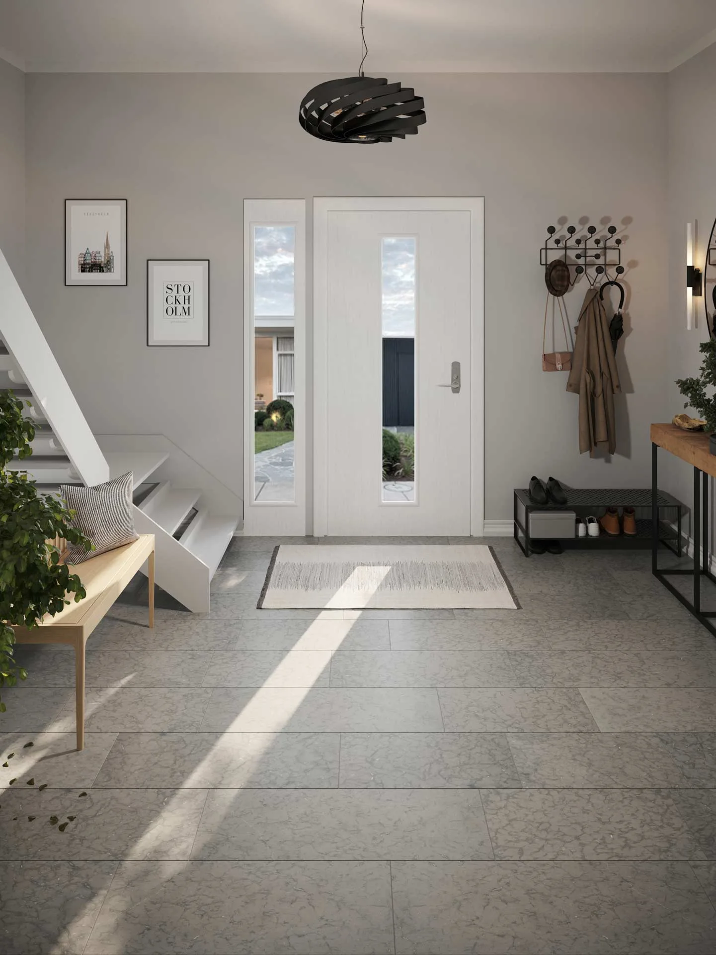
In the wide view, the joints are the first part of the floor that can be followed across the room. Their long horizontal lines widen as they approach us, and shorter divisions break the surface into manageable pieces. The markings inside those pieces remain visible, but they do not dissolve the larger layout.
This distinction matters. A stone surface has its own visual movement, yet a tiled floor is also an assembly. If the pattern and the joint grid compete at the same strength, the floor can become restless. Here, the joints establish the dimensions of the pieces, while the mottled lines supply a finer layer of information.
The diagonal band of sunlight introduces another reading. Inside it, contrast softens and some markings become less conspicuous. In the shaded areas they appear denser. The image therefore shows the finish under two conditions at once, although it cannot tell us exactly how the material would behave under every light or in a physical sample.
Two drawings on one surface
The closer view makes the relationship easier to inspect. The camera looks steeply down, so furniture and walls recede and the floor occupies most of the image.
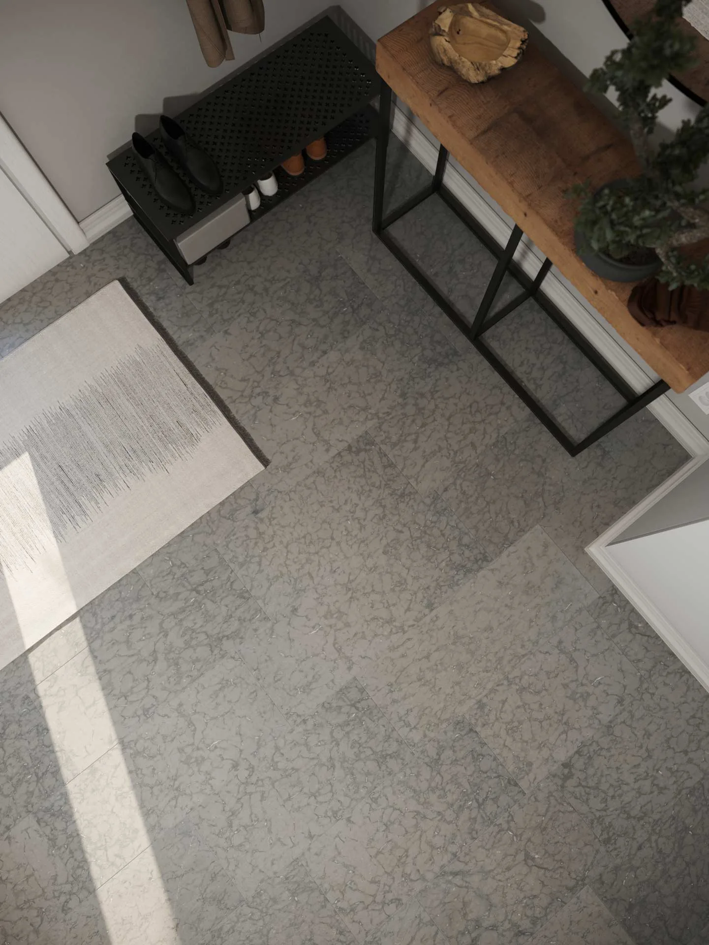
The detail I keep coming back to is the difference between the straight joints and the irregular marks. The joints meet at clear angles and describe the tile layout. Within those boundaries, the darker shapes curl, divide and gather into loose clusters. We can read both systems without mistaking one for the other.
Nearby objects help to calibrate that reading. The thin legs of the console, the edge of the rug and the shoe rack give the tiles familiar neighbours. They prevent the surface pattern from floating at an indeterminate size. Even without measurements, we can judge whether a mark belongs to a broad movement across the floor or to a smaller variation within one piece.
The close view also reveals a useful limit. Bright light does not simply make every detail clearer. The sunlit strip loses some of the subtle tonal difference visible beside it. That reduction is informative: a convincing presentation of stone should allow the material to remain recognisable as illumination changes, but it need not preserve identical contrast everywhere.
When the pattern has a direction
The same viewpoint with the finish labelled Oppdal in the source filename changes the reading more than a colour adjustment would. The tiles are longer, and pale grey bands run broadly along their length.
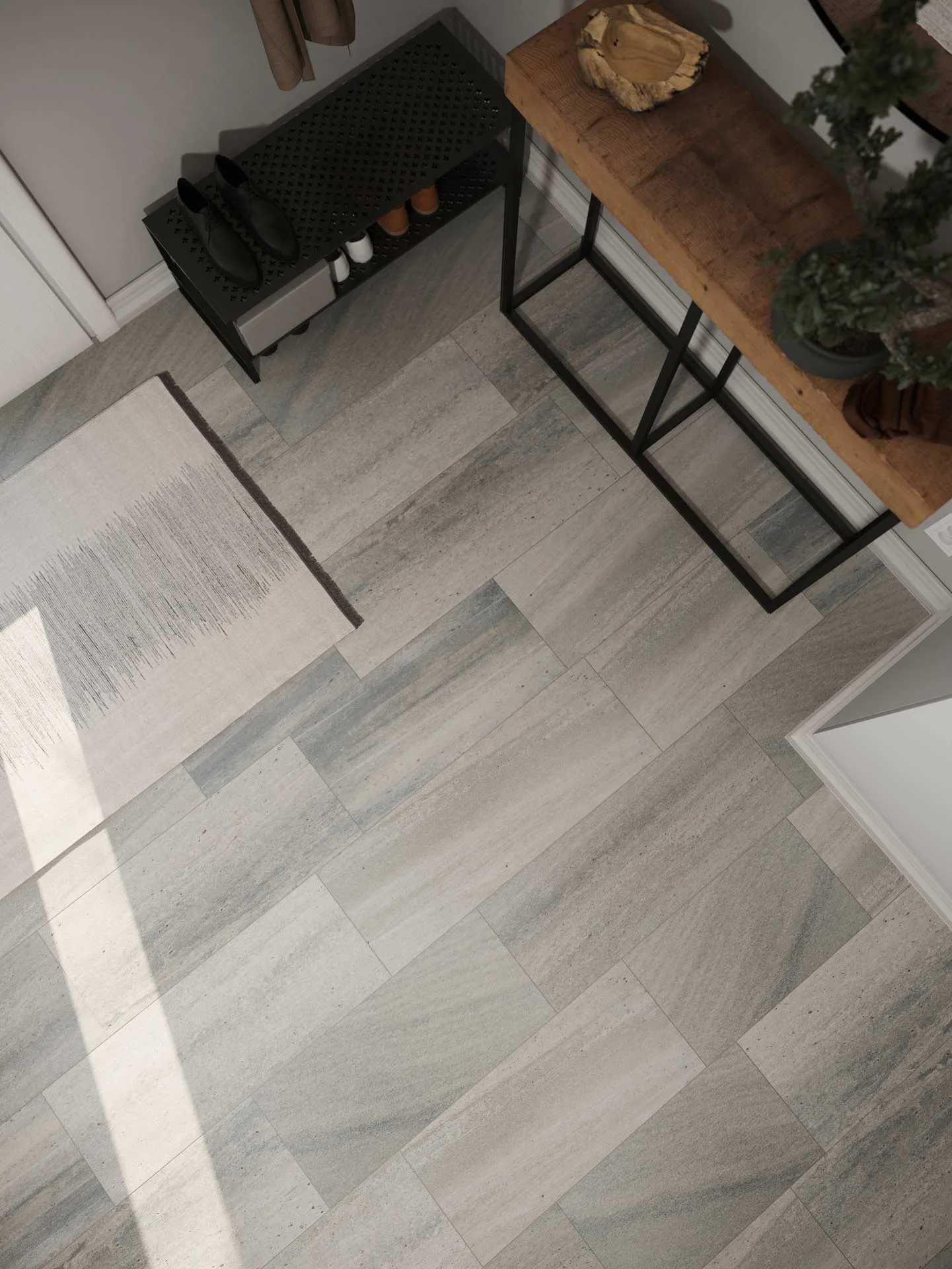
Now the surface markings reinforce the proportions of the pieces. The long bands and the staggered joints pull the eye across the floor in a shared direction. Small dark flecks interrupt that flow, but they do not erase it. The first grey finish felt more like a field of branching marks contained by a grid; this one reads as a set of elongated pieces with movement inside them.
This comparison shows why material character cannot be reduced to adding visual noise. Scale, direction and density all matter, but so does their relationship to the object carrying them. A broad vein may be persuasive on one large slab and distracting when repeated across many small tiles. A linear pattern can lengthen the reading of a piece, while a more dispersed pattern can hold attention within it.
There is no need to show every finish in the series to understand the principle. The useful test is simpler: first trace the joints, then follow the markings, and finally notice what the light preserves or suppresses. When those three readings remain distinct but connected, the stone feels like part of the room rather than a flat image placed over the floor.
Visualizations by Without Camera, used with permission. Stenbolaget – stone tiles is a series of entrance-hall visualizations presenting different tile finishes in a consistent interior setting.